.svg)


 Canada (EN)
 Global (EN)


When I was younger, I had a fleeting aspiration to become an architect. Instead, I happily found myself in the field of product design and realized that good architecture didn’t only apply to physical, built environments. Good architecture is just as essential in digital products, shaping how we interact with them and how we feel about them.
In the past few months, I finally fulfilled my childhood aspiration and spent my days working as an information architect.
Raising the bar on user experience
Dialogue’s Integrated Health Platform has extended its continuum of care with the Wellness Program, which is loaded with features that enable healthier living for everyone. These features deliver the best health outcomes when engaged with on a weekly, or better yet, daily basis. However, most people typically think about their health when there is an issue. This is why we're making it easier than ever for members to engage with their health on a daily basis.
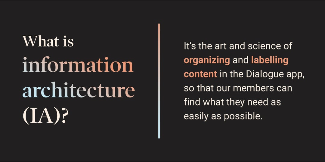
Dialogue went from helping members with their health concerns to empowering them to take control of their total well-being. Our information architecture needed to evolve to make it easy for members to access our new wellness and prevention programs. So we set out to rebuild our app navigation from the ground up, with the ambitious goal of bringing self-serve features and content to the forefront, while ensuring that professional care consultations are still at members’ fingertips.
How might we…?
Now that we had the why, we sought to determine how to best solve this challenge, using an iterative, member-centric approach.
Step 1: Organize
We kicked off solution discovery with an internal card sorting exercise. Folks from all over Dialogue categorized the app’s content and actions into groups, helping us understand how they structure information. These were the four most common categories:
-
Ongoing activities
-
Consultations
-
Self-care
-
Content library
Step 2: Ideate
The product design team brainstormed different ways these four categories could be represented in the user interface. We converged to test the concept that best optimized scalability and flexibility. Flexibility meant ensuring the resulting user experience would be delightful for each and every member, regardless of which health and wellness programs they have access to.
Step 3: Test, learn, iterate
After a workshop to prioritize a list of assumptions to validate, we were excited to start collecting member feedback. Each research round took about a week and blended moderated member interviews with unmoderated usability testing. Every week, the valuable insights gained would be transformed into changes to the prototype. Rinse and repeat.
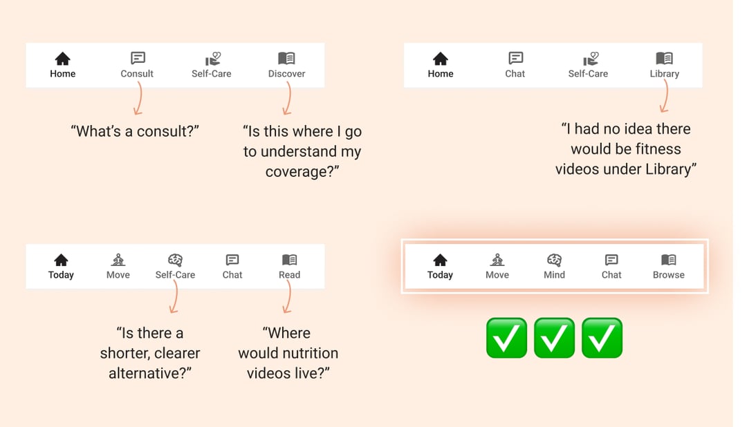
Seven rounds of user research later, we finally felt like we landed on an intuitive, evergreen, and beautiful information architecture.
Change is in the air
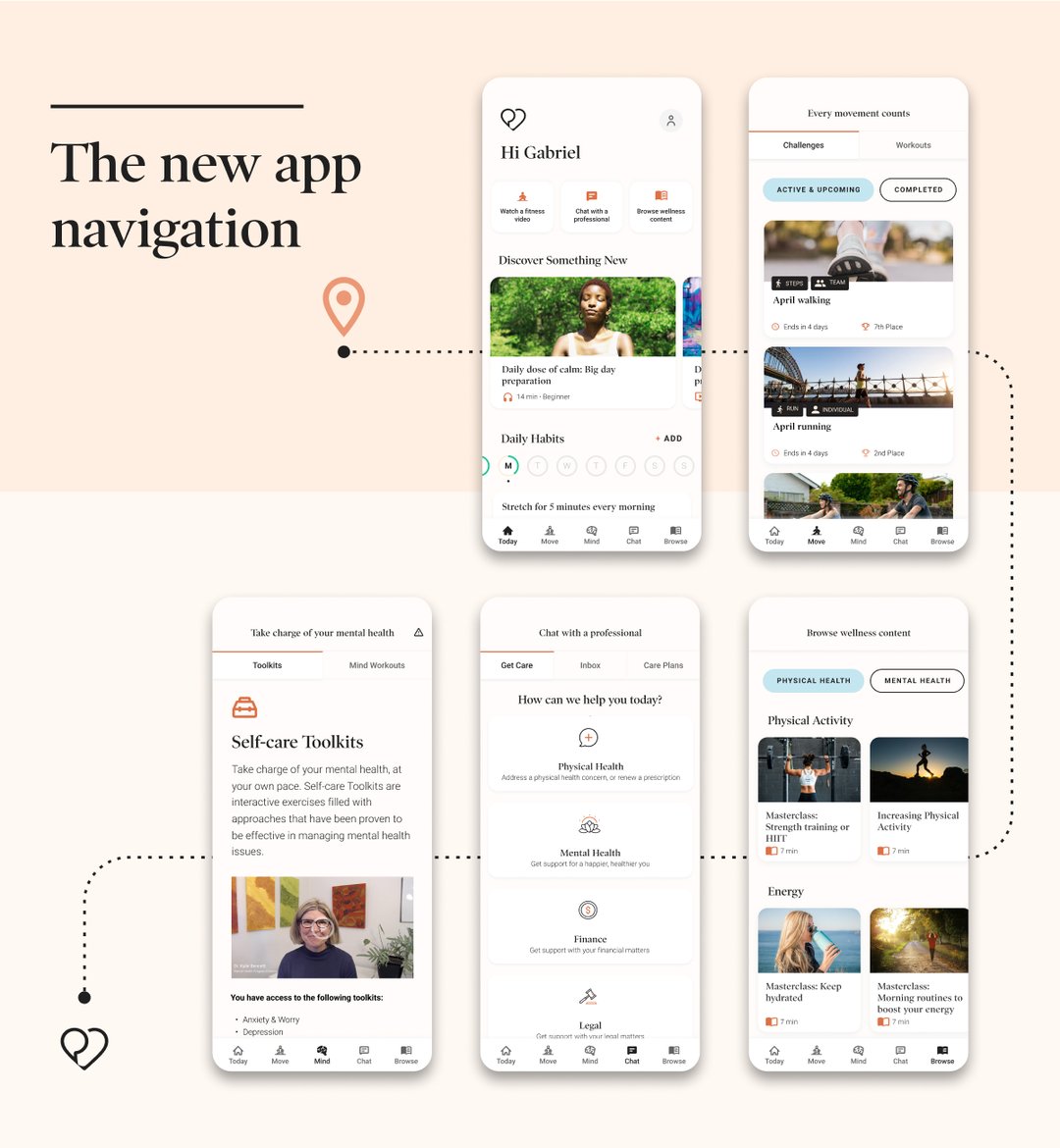
Now, Dialogue members will benefit from this information architecture on the mobile app. The new app navigation breaks down silos between programs, provides quicker access to medically-vetted health and wellness content, and encourages a true Integrated Health Platform experience. Through an iterative, member-centric approach, we made self-serve and provider-led services equally easy to find. Turns out, you can have your sourdough and eat it too.
Discover how Dialogue’s Integrated Health Platform can transform your workplace.