.svg)


![[Webinar] Multigenerational workplaces: Bridging the well-being gap](https://www.dialogue.co/hs-fs/hubfs/2024%20Q1-%20HW%20-%20Resource%20center%20image%20-%20MHW%20EN-1.jpg?width=241&height=151&name=2024%20Q1-%20HW%20-%20Resource%20center%20image%20-%20MHW%20EN-1.jpg)


 Canada (EN)
 Global (EN)


When I joined Dialogue in early 2019 it didn’t take long for me to recognize one indisputable truism: Our co-founders had built a team full of A-players. Talented, passionate, and committed to improving healthcare for all Canadians (and beyond), the speed at which this team builds and continuously improves our industry-leading telemedicine service was both impressive and daunting as a newcomer.
That said, over my first few months at the company a second undeniable fact became apparent - while we were very good at building the future of healthcare, we weren’t particularly good at celebrating or promoting our work. We were like the quiet, hardworking A+ student in the middle-row of the classroom, rarely participating in class discussions but regularly acing projects and exams. The student with class president and valedictorian credentials, but who is sometimes passed-over for those better at self-promoting.
While this approach may be okay in high-school, to achieve our mission we could no longer settle for the quiet, hardworking moniker we’d earned over our first 3+ years as Dialogue.
Part 1: Self-Reflection
Legendary funk artist, James Brown, recorded a song in 1970 called, “Talkin’ Loud and Sayin’ Nothing”. While the message behind the song may not have been directed at brand messaging, it nonetheless emphasizes a universally important concept - that talking loudly without a clear, consistent, relevant message is tantamount to saying nothing at all. Even worse, it may confuse or depreciate a brand in the eyes of the target audience.
So before we began developing bolder in-market messaging, the Dialogue team took a step back to ask ourselves four questions:
- Is our company mission clear and easily understood?
- Are our internal values clearly linked to our mission?
- Is our product strategy connected to our mission, values, and client needs?
- Is our external brand identity and messaging reflective of this mission, values, product strategy, and the general evolution of our business?
The logic of these sequenced questions is obvious: There’s no point in trying to judge or update our external brand if we aren’t clear about our mission, values, and product strategy.
After much internal discussion and debate, we decided the answer to the first three questions was generally “yes”. While we made a few tweaks, the overall essence of our mission, values, and product strategy remains highly relevant for our clients and genuinely motivating for the Dialogue team.
The answer to the fourth question, however, wasn’t quite as positive.
Part 2: Reviewing Our Brand
Our original brand identity was developed several years ago when Dialogue was a much smaller company, in an industry that was truly in its infancy. It served us well throughout our start-up days as we helped educate the Canadian market on the ins and outs of telemedicine.
Three years later, however, we realized our identity did not adequately represent the maturity, professionalism, and enterprise-grade investments we’d made to serve clients - large and small - across the country. In short, we looked more like a tech start-up trying to do healthcare than a healthcare company built on top of really great technology.
In reality, our medical team is now several times larger than the biggest in-person medical clinic in Canada as we’ve added hundreds of healthcare professionals to our team. And our technology investments give us the ability to scale these resources effectively while concurrently improving the patient experience.
Case-in-point: even during the worst days of the COVID-19 outbreak back in March/April 2020, the time our patients waited to see a doctor went from fast to even-faster - an amazing feat that demonstrates how we’ve evolved into a serious healthcare player, working closely with HR professionals and business leaders to improve the well-being of our members and their families.
So, after much internal discussion we concluded that our brand needed an overhaul to ensure how we looked and sounded on the outside matched the sheer horsepower of the people and technology we’d built on the inside.
Part 3: The Process and Brand Positioning
Some agencies and consultants suggest a company rebrand can be done in 8 weeks or less. The reality is that unless the effort is a superficial one the exercise can take much longer. For Dialogue, the process from initiation to launch took more than a year. Rebranding takes time.
While most think of a brand as a collection of creative identity assets (i.e. logo, colours, images, etc.), jumping to this exercise without first establishing (or validating) a brand positioning is a recipe for disaster. Without positioning, how will we know whether our logo should feel serious or whimsical? Should our colour palette feel fresh and vibrant or established and trustworthy?
We worked closely with a Toronto-based agency to reflect on how our mission, values, and product strategy made us different from our competition. We talked directly to several clients, partners, and employees to get at the essence of what made Dialogue special. And we mined the massive log of patient feedback we collect every day to look for trends and themes.
In short, what makes our company special really came down to one thing: Dialogue cares. This came up over and over again, that in every interaction with every stakeholder (our client contacts, patients, employees, brokers, insurance carriers, and more) we consistently showcased deep care and attention to the needs of everyone we worked with.
But “care” is high-level and can mean many things to many people. What does “caring” really mean to our stakeholders? How do we demonstrate this so effectively?
So we kept digging. And through further conversations and reflection we realized that “care” wasn’t just a warm and fuzzy feeling or a superficial smile during a meeting or patient consultation. It revolved around how we’d built our business around the needs of our stakeholders. We heard consistently how interactions with Dialogue feel relationship-based, not transactional.
It turns out that if you do a great job listening to clients, patients, partners, and employees the “caring” part comes naturally. It doesn’t feel forced or inauthentic, because we’ve been speaking the same language as our stakeholders since day one.
This much-needed process was eye-opening and helped us create a new set of brand principles based on these insights upon which our external brand would look, feel, and sound. They are:
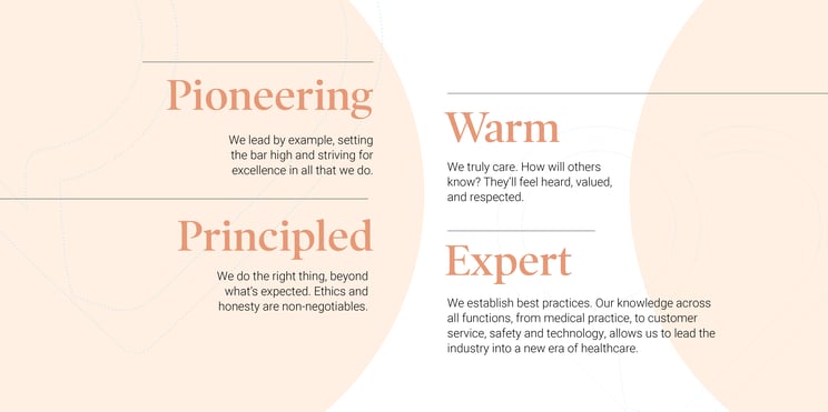
The above reflects what we heard from our audience. It’s what they expect from a market leader that’s building the future of healthcare. And it’s how we deliver that feeling of care, consistently.
While these new brand principles were only one of the outputs from this process, they gave us a foundation upon which to begin re-imagining our external brand identity.
Part 4: Our New Brand Identity
With new insights and brand principles to work from, the identity redesign process was relatively smooth and more straightforward than expected. It’s amazing how easy it was to spot a good creative direction versus a bad one when using our stakeholder insights as a guide.
Part of any good design process is an analysis of competitive branding to ensure our look and feel resonates with our audience but also feels distinctly different from our competitors. We quickly concluded that the design style in our industry was quite homogeneous (colours, typeface, illustration style, etc.) and virtually all of our competitors felt very B2C (business-to-consumer) versus our B2B (business-to-business) model.
Our new brand identity needed to reflect how different we are from those B2C models and reflect the new brand principles that linked back to the specific needs of our key stakeholders.
After weeks of hard work, many iterations, and lots of passionate debates, I couldn’t be more proud of where we landed with our new identity.
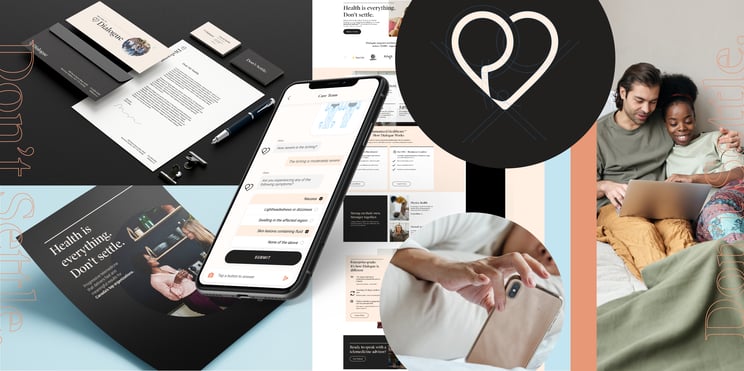
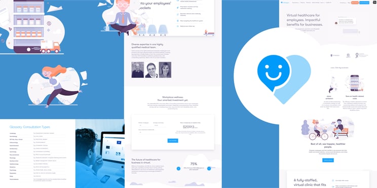
The new visual identity is professional, sophisticated, and very different from others in our space. It reflects our industry expertise, our principled approach, and the continuous innovation that make us pioneers in telemedicine. And most of all, it reflects how much our 700+ employees truly care about everyone we work with - both inside and outside our company.
More specifically, we realized through this process that our stakeholders really loved our existing brand mark. The heart shape reflects how much we care, and the chat bubble accurately represents how we deliver this care through thousands of human-to-human conversations. So instead of starting over, we updated our brand mark by refining these shapes and applying a more sophisticated look overall. The result is the new Dialogue “heart”, which carries the thread from old to new and continues to represent what we stand for every day.
To better reflect the maturity of our business, the sophistication of our operation, and the enterprise-grade investments we’ve made, however, we’ve created an all-new set of colours and typography styles. Of note, our new headline font is a classic, sophisticated serif-type that reflects our serious approach to healthcare, and our colours were selected to match this perspective while also creating visual differentiation within a sea of homogeneous healthcare brands.
We love our new visual brand identity, and while it will surely evolve over time we’re confident that we’ve planted a strong foundation upon which to build for years to come.
In addition to our new visual identity, I’m also proud to highlight two new taglines you’ll see increasingly used on our website (and other places):
Health is everything. Don’t settle.
Connected to our mission as an organization, we feel strongly that everyone should put their health first. As a society I’m sure we’d all agree with this sentiment, but too often we get busy and settle for quick solutions to health or wellness issues that really need more focused attention. This tagline emphasizes our commitment to improving access to quality healthcare, and ultimately bettering the lives of Canadians across the country.

Humanized Healthcare™
While our mission-level tagline clarifies why we’re passionate about Dialogue, Humanized Healthcare™ defines how we deliver for Canadians. With a growing team of hundreds of medical professionals on-staff, our telemedicine service is as human as it gets. Our proprietary technology and AI capabilities were (and will continue to be) purpose-built to reduce the administrative overhead typically associated with medical visits, allowing more time for patient/practitioner interactions. In other words, our unmatched technology makes Dialogue even more human by making our medical team more accessible to our patients.

Final Thoughts
We hope you like what you see. It’s been a labour of love for those involved at Dialogue, and while not always easy or straightforward we’re all very proud of our new identity. Not because it highlights a new path we’re taking as a company, but because it better represents what we’ve built (and continue to build) in support of our clients, partners, patients and employees.
You can reach me at jeff@dialogue.co. Now it’s time to get back to work.